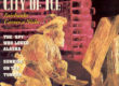
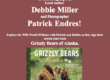
To all of you who were so kind to comment and offer your feedback on the cover of my 2013 Alaska – Profiles in Nature calendar – a big thank you.
I have incorporated some of your suggestions and here is the new version. Of course, nothing is ever final until it goes off to press, but that won’t be too long from now.
I specifically cleaned it up, went with a much bolder font that better represents Alaska and is much more readable on a calendar stand in stores, and removed the black border and snowflakes.
Do you think it looks better?

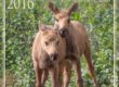
After edits 2013 Calendar cover Before


I kinda like the border, though. (Just can’t please some folks.) 🙂
I like the one with the border too!
I like the new one much better. I didn’t really want to vote for the bears the first time because of the snowflakes and how it was put together. It is much more eye catching now and I think focuses more on your photography. Which is amazing by the way.
Patrick,
A camel is a horse designed by a committee. Thankfully the polar bears remain unaltered, and in this case the layout is much improved. Look out all you kitten calendars, you are no match for the appeal of Alaskan polar bears…
Steve, Indeed, design by committee is often demise. In this case, I thought there was some good input that I had before hand considered, and thus confirmed to a me a little better cover result. Retail sales are not fond of dissenting opinions – usually : )
I think the border worked on last years calendar, and could go or stay, but the simplicity is favored by me in this case.
I would enlarge the bears up to overlap the type. It would still be plenty readable and have a lot more impact.
All the elements look slightly “separated” and there is a natural hole where the heads could be…they are the most important part of the cover. I would pick up the light blue in the ice for “Profiles in Nature” and not make both fonts white and make the 2013 a deeper blue, but not black.
Sue, thanks for the suggestions, I’ll play around with it a bit more.
geez, i missed the first post. so i am confused. i do not know how you get so much done….i am still working on projects that started months ago…ug! i prefer the clean designs and less distracting border so i prefer the first one on the left in this post (always less is more, especially in line with the whole Arctic feel too)….so much more representative of your work. i cannot say i know what appeals to the masses though. i know they will love your calendar though if they just open it up and buy one!
Like the new version. Your eye isn’t looking first at the black border, then the subject. Just let us know when it will be available for sale.
Absolutely looks better (but then you did adopt one of my suggestions). 🙂 I think I agree with the comment about enlarging the size of the bears, but not so much to cause overlap with the text as the interaction of the bears’ faces is perhaps the most important element of the photo. Great job as usual Patrick.
Hello Pat
The new version is a winner. Perhaps on your blog flip the comment below the photographs to “after/before” as had to read a bit hoping that I had misread.
Indeed Mark, that was specifically unclear. I changed the caption.
I like this version better. Can’t wait to see it on the store shelves!