

When the day came that I was asked to plan more than one year ahead of time, I thought: something has gone wrong. But some things are inevitable. As it turns out, before I’ve really hit the sales period for the new calendar I released this year, it’s time to get the next one to the printer. So I’m wondering if I can get a little help from my friends here in selecting the cover.
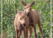
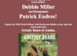
The calendar includes images from across the state, with photographic comments about the process of getting the picture. It is a mix of landscape and wildlife imagery. These are two that I’m considering.
From the perspective of a calendar sitting on a shelf (with a lot of other ones!) which one do you think would be the most eye catching?
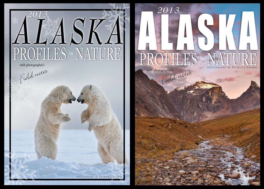
Vote for what you think would be the most appealing calendar cover.
[poll id=”1″]
Thanks for taking a moment to vote.


Since polar bears are running out of habitat, food chain all runs w/ice; they need to be forefront! I might add that Alaskas own governor has proclaimed all out war on the” Grizzly!”
Both are great, but definitely the polar bears!
Patrick I like the bear photo and voted as such better but the font on the landscape is more “alaskan” and would get more attention. I’d do everything you did on the landscape cover, just switch pictures and make the letter black like on the bear cover.
I think the bears have far more human interest because of their standing poses and interaction. Also, for an Alaska calendar, they are more iconic. That is, the viewer immediately “gets it” upon seeing it in the rack, whereas the landscape is more muted in subjects and color, so might not be noticed on first glance like the bears. I don’t like the snow-flake graphics, however. For me, they add a slightly gimmicky, clip-art feel, which distracts from the striking clarity of the two bears in the otherwise bleak background. That’s my goofy, over-analyzed $0.02. 🙂
Hey Patrick, definitely the polar bears for me! Beautiful image, and an absolute Alaskan scene that many people will never get to witness – only through your eyes. However beautiful the nature scene is, I think it could be too recognizable or familiar, and therefore would be less eye catching.
And on a personal note, I really prefer the stronger font you used for “Alaska” on the right cover. I feel the font of the polar bears cover is more ‘feminine’, and takes away from the power of the image.
Just my thoughts! Good luck!
Hi Patrick,
Assuming you let a non-Alaskan vote, I agree with the other commenters. I think the polar bear photo is more “eye catching” and would get much more attention if in a rack of calendars for sale. I also would ditch the inner black border on the polar bear cover, particularly if you go with the bolder “Alaska” graphic from the landscape shot as suggested. I don’t think it adds much where it is, and with bolder graphics would, I think, be distracting. I also agree with the comments about the snow flakes on the polar bear shot. Regardless of which you choose (or something else), two beautiful photos.
The polar bears would appeal to the Costco impulse buying crowd that are already overwhelmed with puppies and Sarah candids. Not including sales, the clear winner is the inspiring landscape.
the Arrigetch photos are my favorite of all your photos this year… but for the calendar on the rack its going to be the bears.
Thank you all so much for your comments. The polar bear is winning right now by a 1 to 6 ratio. Many of your comments hinted at some changes I was considering, and confirmed my thoughts.
I have changed the font to be more bold, removed the black line and the snowflakes for a cleaner presentation. I leaned towards the polar bear shot for a few reasons. For one it is a high profile animal currently, it implies some action, and I like the negative space better in that image–it breathes a little better.
I do agree that “Alaska” could use a stronger font, so I went with a similar rendition of the landscape photo. While I loved my experience in the Arrigetch peaks, that landscape is a little less known, so I think a more universal image is well, more universal. Thanks again and I’ll post the final version in a few days.
All comments are welcome.
I voted for the mountain because the polar bears’ composition on the cover seems unnatural. That’s just my personal opinion. If you bumped the image over so that the bears leg was not cut off by the border, I think I would favor it over the mountain.
Eli,
Check my latest post with the comparison rendition. I think that looks a little better per your comments.
Definitely the bears if you’re selling it via a mass market store. If it was just to photographers than the landscape would be the right choice
love the bears… gotta go with the bears; but definitely a different, subtler font and not sure about the snow flakes… the simpler the better… gorgeous photography by the way… love getting your updates; brightens up my day 🙂