
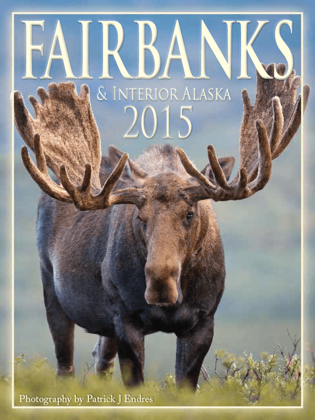
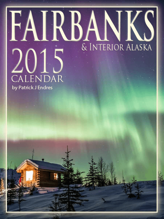
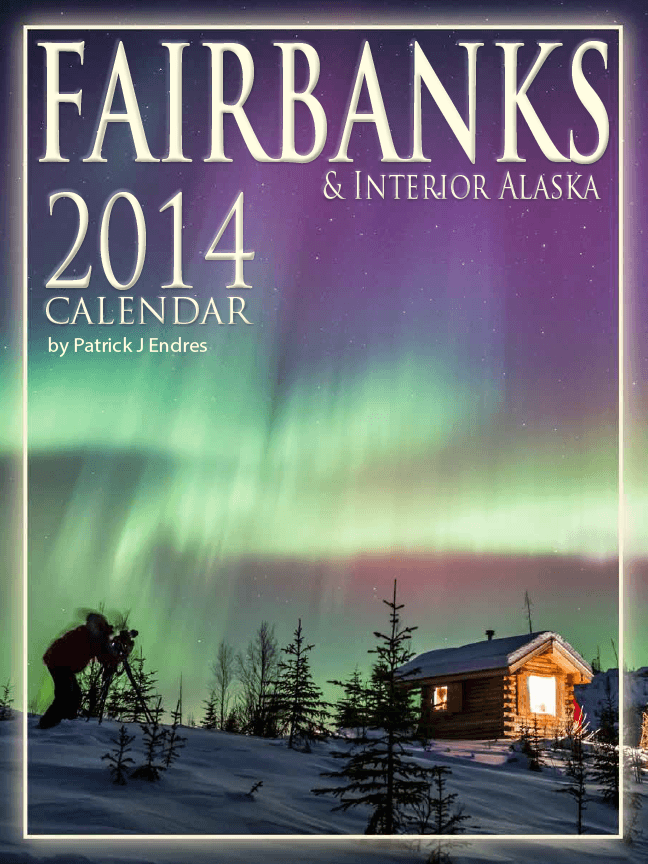
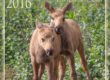
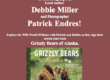
This is part two of the former post. Since I could not put two polls in one post, I had to separate them out. Finicky software. So, sorry for the redundancy. I’d appreciate a click for what you think would be the strongest selling calendar cover. I added one new variation. This calendar highlights the interior regions of Alaska, and the cover should be distinctive of what one may see there.
Thanks,
[poll id=’4′]
Fairbanks & Interior Alaska Calendar

Vote for a 2015 Fairbanks Alaska Calendar Cover: To to see large photos view the original post.This is part tw… http://t.co/08MtrAANVn
Interesting comparing the two aurora and cabin shots. 🙂
Jim McCann liked this on Facebook.
done! all 3 are excellent!
Virginia Wilson liked this on Facebook.
Steve Adams liked this on Facebook.
Tough call. Although I like the middle photo the best, I voted for the moose because I like the way the antlers frame the words.
Of the three image the one that works best is the moose. The moose integrates well with the cover- nice framing. The moose has a good catch- light in his eyes, and the velvet on the antlers is perfect. The one thing I’d tweak would be the immediate foreground- it is just a bit distracting.
As for the Northern lights images, both have technical issues. One has a photographer caught moving in the long exposure, and the other has blown highlights from the window. There is also some red colored object next to the cabin that is distracting.
These are great images- my critique is hyper- technical.
I also note some of your northern lights images- notable the St. Pats day storm that some of the overhead shots have very saturated greens. (too green). It could just be my monitor, or maybe a bit too much saturation added in the DDR.