I’m interrupting my string of posts on Antarctica to ask for a little help from my visually acute freinds out there in cyberland. Its time for me to wrap up my 2011 Fairbanks and Interior Alaska wall calendar and get it off to the printer. I’ve narrowed the cover down to two images. One winter, one summer. A simple question: which do you prefer? In answering, keep in mind that it is a calendar, and think about what would be attractive on a rack full of calendars. Thanks for any feedback.

Option #1 Autumn

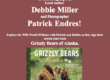
Option #2 Winter


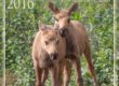

Why did you have to choose my two favorite photos? 🙂 You couldn’t go wrong with either one. I think I’ll vote for #1. I like the color in it, but really, as I said, you couldn’t go wrong with either one.
We like the Winter shot. Both are really nice.
I really like to second one best.
I say photo 2. When you see the word Fairbanks, AK, you don’t think of fall, you think of winter.
Both photos would capture my attention. I believe that I would choose #2 if I had to pick one. It may be because I am live outside Alaska. When I think of Alaska, I think of things that are larger than life. Snow and ice…which I know is not correct but if you asked most people outside that is the response you would get. #2 has a wonderful perspective that gives you a feeling of how small nature can make you feel.
Number 2 definitely. The first has nice color but isn’t as visually gripping. I spent more time looking at the second image. Plus you had an autumn image on the cover of this year’s calendar didn’t you? Yep, I just looked again. Number 2 it is.
The 2nd one w/winter trees!
The second one, it looks like home longer than the first.
Both are lovely, but I would pick #2. A magical shot!
I like photo #2 better, but for a cover I would choose #1. It works better with the copy and the colors will stand out on a bookshelf or as thumbnails on a website.
#2…..first is beautiful but could be a scene from other areas.
#2…..absolutely specific, absolutely the one for telling your story. tks for sharing the opportunity to glimpse. c/
Both photos are beautiful. I really love the colors in the first one. But in my opinion for an Alaskan calender the second photo would be the way to go.
By far, the compositionally stronger, more dynamic, wowing image, is the winter scene. Yet, given the predictable nature of folks thumbing through the plefora of calendar options, I think the other will offer more sales.
I rarely see a state, regional, or country calendar using their cover depicting a winter photo.
This calendar category always has a fantastic winter scene, but its placement is relegated only for December or January. Unfortunate but true.
WOW!, they are both excellent, but as I read other comments and then studied the two I would choose the winter image. No.1 was a bit busy in foreground, when I cropped some off of bottom it seemed to more closely match the winter scene.
But, I’m not the pro, great images you have.
Thanks
Chuck
I like #1. Many of us forget that Alaska has a beautiful summer season and we need to be reminded. Both shots are great
Both images are great but #1 gets my vote for the cover shot as I think the bright colours will make it more eye catching on the rack.
I do love the birch trees and fall colors but I think that the winter shot captures the essence of what most visitors associate with Fairbanks. And I think those icy blues will really stand out from the other calendars. Both are beautiful, Patrick.
I like the second cover with the wintery looking trees. When I think of Alaska, I think of snow, not so much Autumn/Fall.
Bern,
That was the one that was chosen.