
2011 Cover choice from last year, thanks for those who contributed input.
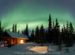
Last year I asked the advice of many of my blog readers for input on the selection of a cover image for my 2011 Fairbanks and Interior Alaska Wall Calendar. Many thanks to you all for your votes as it was the above image that won by a long shot.

Any thoughts on this design and cover selection for my 2012 Fairbanks and Interior Alaska calendar?
It is that time of year again, and I’m working on design for the 2012 calendar (believe it or not), and I’d like anyone’s comments on my current selection for the 2012 Calendar cover. Do you think it represents Alaska’s interior enough for a cover position?


I really like how the second cover turned out. The transparent border is really cool.
That is a great selection for your 2012 calender.
I like the 2nd one very much. It gives off a sense of depth and drama of the scene even though the scene is calm and tranquil. I draws you in. Mystical.
YES!!! 🙂
Representative? Check.
Uniquely so? Check.
Exquisite photograph, all on its own? Check.
Beautiful, Patrick!
Thanks guys, so far, I think I’ll keep the raven photo for the cover of 2012. I appreciate your feedback.
This is by far one of my all time favorites.
It’s a hint of Alaska’s natural world offered in a mysterious thin veil.
Unfortunately the demographic in calendar sales lend themselves more to puppies and flowers – ugh.
Yesterday I spoke with a publisher I’ve worked with in the past, to see what new titles they were working on. Their 2 biggest sellers right now are titles called alien vaults and letters to the dead. Go figure.
Steve,
This image has always been one of my favorites too. But as we have both learned, what is our favorite does not always crossover. It’s an odd world of calendars indeed.
sure, i think this cover represents a side of Interior that AK’ers could imagine and might know, but would NEVER capture thanks to your genius and crazy talent, but it is not what the stereotypic image of Interior might be imagined by lower 48’ers….i imagine this calendar’s audience is primarily Alaskan-based? I think the depth and grandness with a dynamic raven is spiritual and very interesting and would keep my attention if I were shopping for a calendar, but again, I am a photog and can appreciate its value even more than average calendar buyer….by the way, I will be purchasing two of the few you have left in your office! Still loving your work!
Sue,
The proofs are under final review, I’m sticking with the Raven shot. I agree with you that it represent the interior, although not in the most classic sense. I like the mood of the image and it is primarily for a local audience, so we shall see how it sells. Thanks for your input.