Skip to content
AlaskaPhotoGraphics
Alaska photos and Alaska stock photography for your publishing needs
About
AlaskaPhotoGraphics
Patrick Endres
Licensing Photos
Contact
PHOTOS
ALL CATEGORIES
Adventure
Alaska Widllife
Aurora Borealis
Industry
Lifestyle
Mountains
Nature
Panoramas
Parks & Public Lands
Regions
Roads
Towns
Beyond Alaska
Prints
Posts
eBook: How to Photograph the Northern Lights
All Posts
Alaska Photo Articles
Alaska Wildlife Photography Tips
Cold Weather Photography
Links & Resources
Tips on How to Photograph the Aurora Borealis
Where to Photograph in Alaska
Account
Lightbox
Cart
Alaska Photos
~ for all your publishing needs ~
Browse Alaska photography by category, or search by map or keywords.
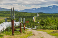
Alaska Oil Pipeline
Alaska Oil Pipeline
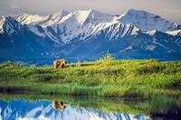
Wildlife
Alaska Wildlife
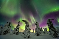
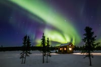
Aurora Borealis
Aurora Borealis
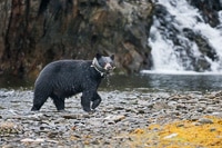
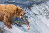
Bears
Bears
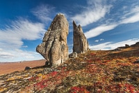
Bering Land Bridge Preserve
Bering Land Bridge
Link
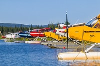
Bush Planes
Caribou
Caribou
Link
Cold Weather
Link
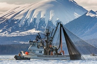
Commercial Fishing
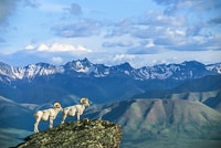
Dall Sheep
Dall Sheep
Link
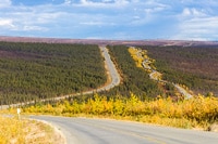
Dalton Highway
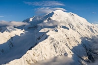
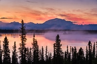
Denali
Denali
Link
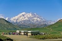
Denali National Park
Link
Dog Mushing
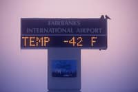
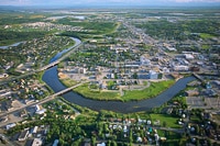
Fairbanks, AK
Fairbanks Alaska
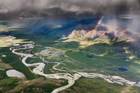
Alaska Aerials
From Above – Aerials
Gates of the Arctic
Gates of the Arctic
Link
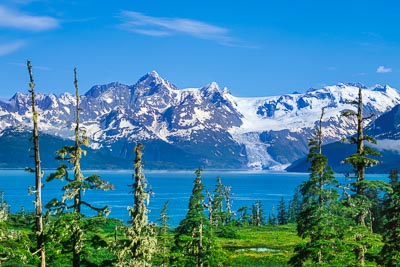
Glaciers
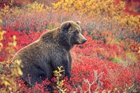
Grizzly Bears
Grizzly Bears
Katmai National Park
Katmai National Park
Link
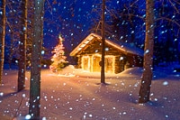
Log Cabins
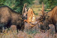
Moose
Moose
Link
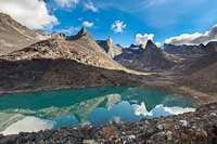
Mountains
Bering Land Bridge Preserve
National Petroleum Reserve
Alaska Landscapes
Nature Landscapes
Panoramas
Panoramas
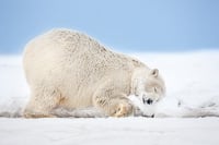
Polar Bears
Polar Bears
Prince William Sound
Prince William Sound
Link
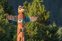
Totem Poles
Winter
Winter
Go to Top


