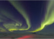
ATT 2011 Calendar

Polar bear cleaning fur, Beaufort Sea, arctic Alaska. Canon 1Ds Mark III, 500mm f/4L IS, 1/320 sec. @f/5.6, ISO 800, hand held
For 25 years AT&T has had a tradition of publishing a calendar that is distributed freely (and download-able as a screen saver–I’ll share that link when it is available). I’ve had my work selected for some of those calendars, and this year, they took a slightly different angle by selecting a wildlife image. In years past I’ve had some runner up wildlife candidates, but none that made it all the way to selection. It’s hard to find a more magnetic and iconic subject of Alaska than a polar bear. Once you watch one play in the frigid icy waters of the Beaufort Sea, their adaptations to live in the landscape they do is beyond remarkable.
How a photo is made is often of equal interest to me as the photo itself. This particular shot was “on the margins” in all ways. Low light, high ISO, marginal shutter speed, cold hands having problems focus tracking–but the movement slowed enough for the shutter speed to sharply freeze the face. I attempt to think panorama when I’m in the field, since I gave up the 6×17 film camera years ago. It’s a challenge to think compositional when you don’t see the whole scene, but there are times when it works out. I often photograph panos for the express reason that they include “extra” negative space, which is a design element that is strongly desired, and usually not an element that is fitting for fine art prints. This frame is a stitch of two images shot side by side.
I will have some new material of polar bears on my website soon, and I’m excited to share some of the cool scenes. You can see more polar bear photos and arctic wildlife photos respectively on my website.


I’m guessing the 5D mark III is a typo?
Peyton, unfortunately you are so right, it was a typo, but I would like get my hands on a 5dIII. I corrected it, it was taken with a 1Ds mark III.
This is an excellent photo combined with great design. I really like how it turned out. Was the sky added?
Eli, part of the sky was from another photo as I was shooting quite tight wight the 500. On another note, I was glad to see your cover photo on the Ruralite. Great job, what lens did you use?
Congratulations Patrick, Great shot!
I don’t care at all for the layout however. Whats with the orange ball and green splat and red arrow? A beautiful calendar to look at through out the year is partially diminished with this “artists misconception”.
In a magazine ad, maybe, but for a large, year long wall calendar??? I guess designers have to leave their mark.
Congratulations Patrick!
Thanks Calvin and Ron,
Calvin, it looks like the orange ball and green object are elements in the new branding of ATT, judging from the Ap on my Iphone. As to how they work in this layout is bound to deliver a variety of opinions. I find the dates a little hard to read with all the overlapping lines. I am glad however that they were open to go with a wildlife shot, as an alternative to previous years.
Its simply iconic. This pic is going to have a life that will go far beyond a mere mortal. Mental note to self – shoot more negative space around subject, something I’ve only considered for landscapes. I’m looking forward to the calendar!
The graphic circus like distractions is obscene. Regardless, when I receive my signed copy, hint, hint, I will display it proudly. “Yes it true, I know him”
Steve,
That copy . . . will be coming 🙂
Congratulations, always loved the AT&T calendars and will be looking forward to this one.
Thanks Mike, I’m looking forward to seeing the reproduction quality, and should have a few copies before long.
Is 2014 ATT yours? Brooks Range? Gates of arctic?